GiniMachine Update for Exact Model Outputs: Calibration Curve for Probability of Default

Your model might be smart — but is it accurate? GiniMachine’s new Calibration Curve for probability of default (PD) ensures that your model outputs align with real-world results and highlights where the model is spot-on or drifts.
What is a Probability Calibration Curve
Probability calibration means translating a model’s raw scores into probabilities of default (PD). In other words, a well-calibrated model’s predicted PD should match the realized default frequencies. For example, if a portfolio of loans is assigned a 5% PD, about 5% of those loans should actually default. This alignment matters greatly for lenders — it makes model outputs actionable as probabilities rather than arbitrary scores.
In credit risk, accurate PDs are crucial for pricing, provisioning, and regulatory compliance. For instance, in IFRS 9 expected credit loss calculations, an understated PD leads to underestimating loss reserves (provisions). That means, a model that predicts an average 65% default rate when the actual default rate is 67.5% would leave a shortfall in provisions. Thus, calibration ensures that the model’s predicted probabilities reflect observed default rates, converting raw model scores into reliable default probabilities.
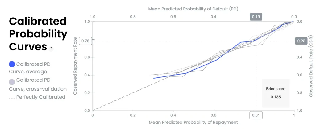
GiniMachine’s Calibration Curves chart (aka reliability diagram)
The dashed diagonal line represents a perfectly calibrated model. The blue line shows the calibration curve of the final scoring model, its mean predicted probabilities of default (PD) vs. observed default rates (ODR). Solid grey lines represent calibration curves from individual cross-validation folds, while the blue line corresponds to their average. Ideally, the blue curve should closely follow the 45° diagonal, indicating the model’s predicted probabilities align with realized default frequencies. When the curve deviates from the diagonal, it reveals where the model is over- or under-predicting risk. The Brier score on the right, 0.135 in this example, quantifies the overall calibration error.
Interpreting the Calibration Chart
- Perfect calibration (diagonal)
The dashed line at 45° is the reference for perfect calibration. Points or curves on this line mean the predicted PD equals the observed default rate ODR for that group (model’s probability estimates are spot on). - Average PD curve (blue)
The solid blue line is the calibration curve of the final scoring model, averaged across all cross-validation folds. It plots the mean predicted probabilities of default vs. their observed fraction in each bin. The closer this blue curve is to the diagonal, the more accurate the model’s probability outputs are. - Cross-validation curves (grey)
Each thin grey line is the calibration curve from a single cross-validation fold, illustrating how calibration varies across different data subsets. Closely clustered grey lines indicate consistent calibration, while wider dispersion reflects model instability and sensitivity to data partitioning. The final model (blue line) is an ensemble average of these folds. - Above vs. below diagonal
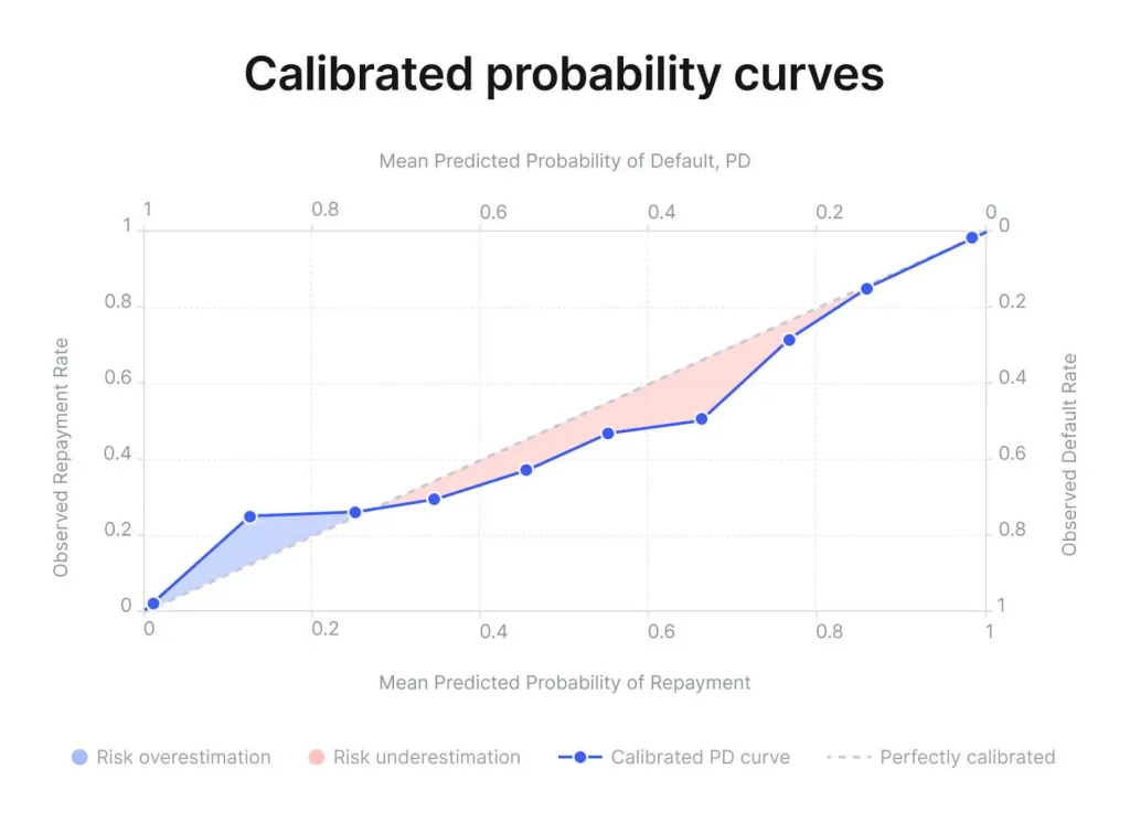
The position of the curve relative to the diagonal indicates bias in probability estimates. When the curve lies below the diagonal, the model is underestimating risk (observed default rates are higher than predicted probabilities for those bins). Conversely, if the curve is above the diagonal, the model is overestimating risk (predicting higher PD than what actually occurs). A well-calibrated model’s curve will stay near the 45° line across all probability ranges.
How Quantile Binning Makes Calibration More Reliable
GiniMachine constructs the calibration curve using quantile binning of predictions. This means model scores (predicted PDs) are sliced into bins such that each bin contains an equal number of samples. For each bin, the average predicted PD is compared to the observed fraction of defaults in that bin to plot one point on the chart.
The advantage of quantile binning is that every bin is supported by roughly the same sample size, ensuring each calibration point is statistically meaningful. This approach is especially robust on smaller datasets or when some score ranges have few examples. By allocating equal sample counts per bin, the curve avoids noisy, sparsely populated bins and provides a reliable picture of calibration across the score spectrum. In practice, a common choice is to split predicted values into ten equal-frequency bins (each 10%), i.e. decile binning.
Understanding Brier Score
In the calibration chart, GiniMachine also displays the Brier score (shown as 0.135 in the screenshot). The Brier score is a proper scoring metric that captures the mean squared error between the predicted probability and the actual outcome (default or not). In essence, it measures overall calibration accuracy.
The score ranges from 0 (a perfect prediction) to about 0.25 (a no-skill model predicting 50% for either outcome). Therefore, lower is better: a Brier of 0 would mean the model’s PD estimates were exactly correct for every case, whereas ≈0.25 would be as bad as flipping a coin. In practice, a Brier score below ≈0.15 generally indicates the model is well-calibrated, while values closer to 0.25 suggest unreliable probability estimates. That said, interpretation should take into account relative performance against benchmarks, since the final score can depend on the dataset quality and context..
The Brier score complements the visual calibration curve by condensing performance into a single number—but it should be considered alongside the curve. For example, two models might have the same Brier score, but one could have a slight consistent bias (curve slightly off-center), while another might have large miscalibration in one region offset by good calibration elsewhere. The reliability diagram shows where the model deviates from ideal, and the Brier score summarizes how much error there is on average. Using both, analysts can assess not just the overall calibration quality but also pinpoint specific probability ranges where the model may need improvement.
Key Takeaways for Model Users
- Trustworthiness of PD estimates
By reviewing the calibration curve and Brier score, credit risk professionals can judge if the model’s PD outputs can be taken at face value. If the blue curve hugs the diagonal and the Brier score is low, the predicted default probabilities are credible for use in decision-making (e.g. setting interest rates, capital reserves). - Over- or under-prediction
The curve’s shape highlights any systematic bias. For instance, if the curve dips below the diagonal at higher probabilities of default, the model is understating risk for high-risk borrowers — an alert for model validators to potentially adjust or scrutinize those PD estimates. If above the diagonal in some regions, the model is overly conservative there, indicating missed business opportunities and the possibility of model optimization. - Model improvement and calibration strategies
A visibly off-diagonal curve or a high Brier score signals that the model’s probabilities are not well-calibrated. In such cases, users might apply calibration techniques (e.g. adjust the score-to-PD mapping or use calibration algorithms) or retrain the model with more data.
The insights from the reliability diagram can guide where the calibration is poor — for example, the model is good at predicting low PDs but overestimates in the mid-range. Addressing these issues can improve the model’s real-world performance without necessarily changing its rank-ordering / scoring power. - Cross-validation confidence
The presence of multiple grey fold curves gives an idea of calibration stability. If calibration is consistent across folds (grey lines tightly clustered), users can be more confident that the final calibration is generalizable and not an artifact of a particular split. If the fold curves differ significantly, caution is warranted — the model’s probability estimates might fluctuate on different samples, indicating uncertainty that could merit gathering more data or simplifying the model. - Holistic performance assessment
Finally, calibration analysis (the calibration curve + Brier score) complements discrimination metrics like ROC-AUC, Gini, or KS score. A model with a high Gini index may still be poorly calibrated, meaning it ranks borrowers effectively but does not produce accurate probability estimates. By examining the calibration curve and Brier score alongside performance metrics, analysts and executives gain a more complete understanding of model quality. This supports informed decisions on model approval, setting cut-off thresholds, adequately provisioning, and effectively communicating model effectiveness to regulators.