From Black Box to Clarity: Radar Chart for Reliable AI Models is Live

AI-trained models shouldn’t be black boxes, especially when they influence high-stakes financial decisions. GiniMachine’s new Attribute-Importance Radar Chart accelerates understanding which factors drive your model, how consistently they influence predictions, and whether their importance remains stable across different data samples. Below we elaborate on the peculiarities of this new functionality.
How Radar Chart Reflects Stability Analysis of the Model
Attribute importance weights are one of the key outputs of GiniMachine’s model calibration. This analysis shows how much influence each feature had in the final scoring model, based on patterns learned from your own dataset. In simple terms, the higher a feature’s weight, the larger the effect that feature has on the model’s prediction.
By highlighting these data-driven importance weights, GiniMachine reveals the specific risk drivers that matter most for your portfolio. For quick, visual explainability, these insights are now presented in an Attribute-Importance Radar Chart.
This radar chart makes it easy to see not only the top risk drivers at a glance, but also how stable each driver’s influence is across different validation folds (the multiple splits of the data used in cross-validation). In one view, you can identify the key predictive factors and verify whether their impact is consistent—confirming that the model isn’t relying on one-off patterns from any single sample. This fast explainability is invaluable for communicating model behavior to various stakeholders and building trust in the model’s robustness. Different stakeholders in your organization can leverage the radar chart’s explainability in various ways:
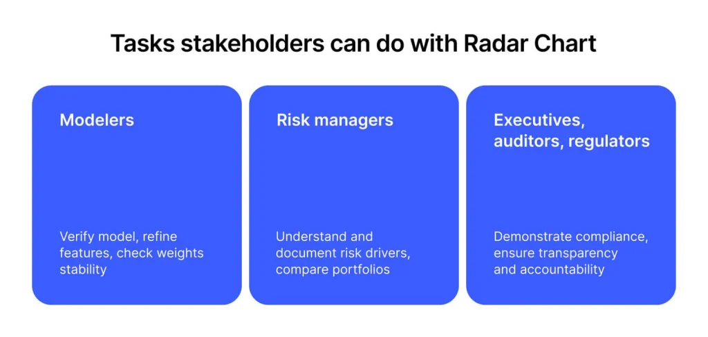
- Modelers (data scientists): For those building and validating the model, the feature stability view supports feature engineering and verification. It helps confirm that the model is using meaningful signals and not picking up spurious correlations. If a feature’s importance is unstable across folds, modelers can investigate further (it might indicate data leakage or an unreliable predictor) and refine the model accordingly.
- Risk managers: For risk management teams, understanding and documenting the drivers of risk is essential. The radar chart clearly shows which factors drive the risk score, providing transparency for internal risk assessments and reports. It allows risk managers to ensure the model’s results align with business intuition and to explain these drivers in credit policy documents or to management.
- Executives, auditors, and regulators: High-level stakeholders require assurance that the model is transparent, interpretable, and compliant. The attribute importance visualization offers evidence that the AI model’s decisions can be explained by understandable factors, aligning with regulatory expectations (such as the Basel Framework and the EU AI Act) for transparency and human oversight. It demonstrates reliability and accountability, giving executives and auditors confidence that the model meets governance standards.
How to Read Attribute-Importance Radar Chart
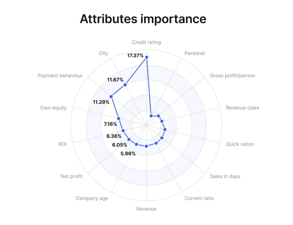
Each spoke on the radar corresponds to one input feature (e.g. Credit Rating, Revenue, etc.), and the distance from the center represents that feature’s importance weight (as a percentage of total model importance).
The chart overlays multiple polygons—one for each cross-validation fold’s results (grey lines)—along with a bold outline for the final model’s importance weights (blue line). This overlay lets you see how consistent each feature’s influence was across folds: if the shapes nearly coincide on a given spoke, that feature’s importance was stable; if one fold’s shape protrudes significantly outward on a particular feature, that feature’s importance varied in that fold.
In this example, Credit Rating shows a high and consistently measured importance (~16-18% in every fold), indicating a reliable predictor, whereas a hypothetical feature that only spikes in one fold would appear as a lone ‘flare’ on the chart. When viewing the radar chart, here’s how to interpret what you see:
- Tightly overlapping shapes (stable drivers): if the polygons from different folds overlap closely for all features, the model has identified the same top drivers every time. This tight overlap indicates those features are stable, robust predictors whose influence does not change much across samples.
- One petal flaring out (unstable feature): if one fold’s shape has a ‘petal’ that extends much further out on one feature than the others, that feature’s importance spiked in that fold. Such a flare suggests an unstable or data-leaky feature—in one subset of the data the model found it very important, but not in others. This warrants investigation, as the feature might not generalize well.
- Shifted shapes between folds (sensitivity to data split): if the overall radar shape differs significantly from fold to fold (barely overlapping at all), the model’s feature importance rankings are inconsistent. This means the model may be sensitive to the sample structure, with its conclusions changing depending on the training subset. Lack of overlap could signal overfitting or that the model is picking up patterns that don’t hold across the whole dataset.
GiniMachine’s Attribute-Importance Radar Chart could be used to evaluate feature stability both within a single model (across cross-validation folds) and between different models.
How Stability Analysis of a Single Model Is Performed
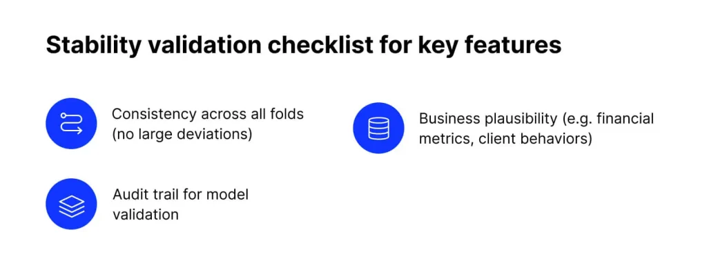
Before finalizing a model, run through the following stability validation checklist to ensure the model is reliable and explainable:
- Consistency of top features: Verify that the top contributing features remain similar across all cross-validation folds. For example, a top feature’s importance in any fold should not diverge by more than ~30% from its importance in other folds. Large deviations in a feature’s weight between folds are red flags and should be investigated.
- Business plausibility: Confirm that the key features driving the model make sense from a business perspective. The most influential model drivers should be intuitively plausible (e.g. financial metrics, client behaviors) rather than obscure or accidental correlations. If a highly ranked feature is hard to explain or seems unrelated to known risk factors, it may be a spurious or proxy variable that needs closer examination.
- Availability of an audit trail: Archive the radar chart and stability analysis as part of your model documentation. These artifacts provide an audit trail for model validation, demonstrating to auditors and regulators that you have checked the model’s robustness and can explain its behavior across different data samples. This practice supports transparency and compliance, helping satisfy AI governance standards on human oversight and reliability.
By incorporating stability analysis into model calibration, GiniMachine ensures your scoring model is not a ‘black box.’ The Attribute-Importance Radar Chart delivers quick insight into how the model works and how consistently it performs. This strengthens human oversight of the AI system and boosts confidence that the model’s predictions are based on stable, explainable factors, which is a key requirement for responsible AI in finance.
How Stability Analysis Between Models Is Performed
Attribute-importance weights quantify each feature’s influence on a model’s predictions. These weights are visualized in a radar chart, where each attribute is an axis and its relative importance (as a percentage) determines the distance from the center.
By overlaying the current model’s importance profile with a baseline—such as a previous version, a model trained on a different segment or time periodthe radar chart highlights potential changes caused by data drift, retraining, or shifts in population behavior.
Comparing with a benchmark model—such as an industry standard, a regulatory reference, or a well-validated champion model—provides a meaningful check on whether the new model relies on similar drivers or diverges significantly. This perspective is essential for trust, validation, and governance.
The radar chart can exhibit distinct stability patterns. The table below outlines typical patterns, their interpretation, and recommended actions.
Model vs. Baseline Stability Patterns
| Stability pattern | Interpretation | Recommended action |
|---|---|---|
| Stable (Overlapping) | The model’s current importance weights virtually mirror the baseline. All key predictors remain unchanged, indicating no evidence of data or concept drift. | No immediate action needed beyond routine monitoring. Continue standard model performance tracking and periodic reviews as per model governance policies. |
| Moderate shifts | One or a few attributes show noticeable changes in importance compared to the baseline, though the overall shape is similar. This suggests early signs of drift in specific areas, while the model remains largely reliable. | Investigate the attributes with changed weights to identify potential causes (e.g. data changes affecting those features). Consider minor model adjustments or increased monitoring. Prepare for a model update if these shifts continue in subsequent analyses. |
| Significant divergence | The importance distribution has changed substantially. Former top predictors may have dropped or new ones have surged, indicating potential concept drift or major changes in data patterns affecting model behavior. | Initiate a thorough model review immediately. Validate data integrity and check for drift causes, then retrain the model on updated data if necessary. Document and communicate any changes in key drivers to maintain interpretability and compliance. |
To sum up, the Attribute-Importance Radar Chart enables clear model comparisons across multiple dimensions:
- Across time—detecting concept/data drift
- Across segments—checking consistency across populations
- Across versions—comparing baseline vs. updated models
Against a benchmark—ensuring alignment with standards or expectations
Benefits the Radar Chart Brings to the Stakeholders
Beyond visual clarity, the Radar Chart adds strategic value. By turning complex stability analysis into a format everyone can understand, it helps each stakeholder group act with clarity and confidence.
Data analysts and risk managers: By quantifying model stability, analysts can quickly detect when a model’s predictive patterns begin to drift. This proactive model risk monitoring enables the risk team to trace and explain shifts in important features early, ensuring the model remains reliable. It also makes the model’s behavior more interpretable over time, allowing for timely adjustments that keep performance on track.
Executives, auditors and regulators: for leadership and oversight stakeholders, stability analysis provides much-needed transparency and traceability into the model’s decision logic. It demonstrates that the organization actively monitors and controls its AI models, aligning with regulatory expectations for sound model governance and accountability (e.g. Basel Framework SRP 20.10 on ongoing model risk monitoring, and EU AI Act Articles 13–14 on AI system transparency and traceability). Ultimately, this boosts confidence that the model remains trustworthy, compliant, and well-controlled throughout its lifecycle.
In practice, GiniMachine’s Attribute-Importance Radar Chart isn’t only a technical tool. It equips organizations with both the insight and the proof that their AI models are transparent and well-regulated.